Branding a Green Hydrogen Support Company:
In this blog, I discuss the branding project I undertook with Water to Water, an Aberdeen-based energy company. They turned to me for support in 2021 to elevate their business through content and visual resources.
Read the full case study to learn about the benefits gained from working with me and how I worked with the client to address challenges and identify opportunities.
Background on Water to Water’s work

Water to Water is an Aberdeen-based company looking to develop green hydrogen communities locally and globally to accelerate the transition to a net-zero emissions future. The organisation aims to be the independent developer of choice for converting rural and islanded communities into energy-independent renewable hydrogen fuel producers. Water to Water brings a unique project-focused approach to creating and developing renewable energy hydrogen projects.
Hydrogen can be produced sustainably. However, this is only the case for green hydrogen due to being produced using electricity solely from renewable resources. Blue hydrogen uses natural gas, therefore it isn’t as sustainable and environmentally friendly as green. Green hydrogen is a huge opportunity for businesses looking into a sustainable energy source, hence Water to Water’s entry into the market.
Main challenge
Water to Water came to me at the beginning of their business journey. They needed a strong brand, visuals, and a platform to showcase their projects and work around green hydrogen. This should be done in an engaging and simple format to be easily understood. They were looking to take their business to the next level, with the key assets to drive this.
How I helped
Once the challenge was outlined by Water to Water, I planned the assets and help needed to deliver the best support for the client and meet their needs, covering brand identity, website and video animation.
Throughout the first stages, we were able to keep close contact and Water to Water trusted my design skills as the best fit for their brand. Our first meetings were an opportunity to better understand what the client wanted to achieve. Following initial meetings, I spent time reviewing the process of developing the brand.
Created visual assets reflective of Water to Water’s work
It was important to the client that we created a logo that best represents what the company does. This gave me an excellent base to work from, as I was able to create a logo to encompass the cycle of the green hydrogen process. The logo design reflected the three-parts which are involved in producing hydrogen:
- Part 1: Adding the water (first blue circle)
- Part 2: Outcome of when a car/machine uses hydrogen is water (second blue circle).
- Part 3: The only energy for producing hydrogen comes from renewable power (green circle).

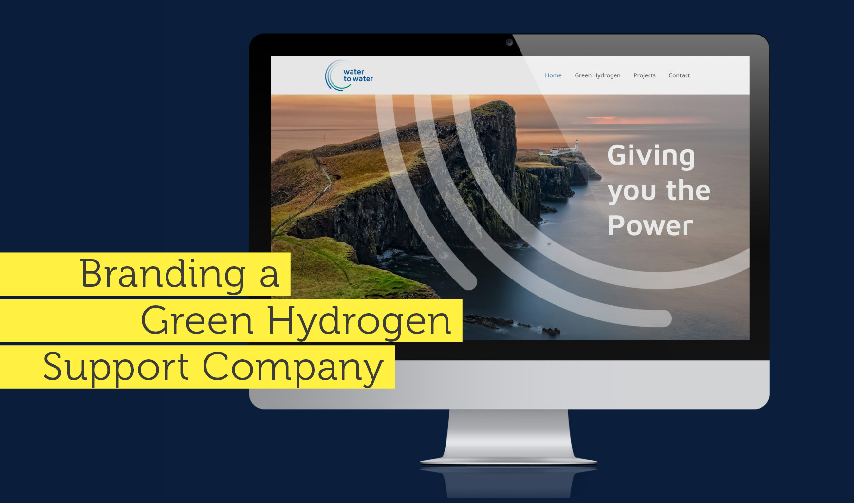
This concept was then also used for brand images, keeping the consistency of the brand throughout its materials. As Water to Water mainly concentrates on bringing hydrogen power to rural areas, the imagery used across materials shows islands and rural communities. The circular shapes of the logo became a graphical element on top of the images to brand them further.
Creative website design to highlight Water to Water’s key capabilities

The website was set up initially with only three pages, which was sufficient to show the work Water to Water does. It followed the brand identity guidelines and used mainly the two colours of the logo and images. It was important to give an introduction to the business but also to help people understand the difference between blue and green hydrogen. Moving forward, there is space on the website to showcase future projects.
Delivered a unique video to bring the brand to life
Once I started working on the animated video, the brand identity had to be expanded, especially the colour scheme, graphics development and the animated logo. I mainly used different shades of green and blue to stay within the original guidelines, displaying the key themes of water and environmentalism. But other colours were used, ensuring they harmonised with the blue and green tones to create a visually appealing and balanced visual look. For instance, as the main colours are quite ‘cold’, I added browns, reds and yellows to drive emotions into a more positive, warm feeling. The music that accompanied the video was also uplifting to match this.
The outcome of the project
Water to Water’s brand identity is a professional, strong brand. It was important for the client not to look like a small start-up business but instead more established, trustworthy and credible.
The website has given Water to Water a platform to bring their work to life and better explain the role of hydrogen, its benefits, the differences between green and blue and a place to showcase their projects.
The animated video is a simple and easy way to explain the process of green hydrogen and to showcase Water to Water’s first project, Glensaugh, a research farm in Aberdeenshire. The video animation is available on the website and YouTube. Having the video widely accessible is great for project promotion for Water to Water and the James Hutton Institute, with who Water to Water worked closely on the research farm project. It also makes the larger audience aware of the differences in hydrogen production.
Interested in learning more about how I can help you enhance your brand? If you’re looking to create a new brand or you’re an established business interested in rebranding, get in touch with me by emailing mail@anjapeter.com. I’d love to hear from you!