

Graphic Design Trends Throughout the Decades Part 2 – 21st Century:
In the ever-changing world of graphic design, the 21st century has been a canvas for a dynamic and unique landscape of creativity. From the early days of skeuomorphism to today’s flat, minimalistic aesthetics, this century has seen an array of graphic design trends. Each trend has left its mark on every industry, from web design to pop culture and branding.
In the final instalment of this 2-part blog, I explore the most notable graphic design trends throughout the 21st century so far. So, join me on a journey through nostalgia-driven revivals and captivating corporate design.
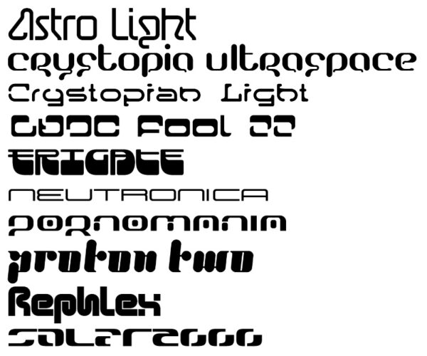
Y2K
To kick off the nostalgia, we are going straight to the early 2000s when computers and the internet took hold. Say goodbye to the subtlety of the late 90s and hello to metallics, sparkles and quirky graphics.
Cambridge Dictionary describes the term “Y2K” as the Y2K problem, otherwise known as the millennium bug. This string of problems arose across computing systems when the date changed from 1999 to 2000.
With the introduction of more accessible tech and digital items, Y2K incorporated a futuristic design, using graphics laced with glitter, plastic effects, and many bold colours. That being said, the Y2K era also integrated darkerthemes of what was left of the Grunge era (think The Matrix-inspired glitches, glowing green text, and the colour black). Overall, the early 2000s were filled with technological optimism and the excitement of exploring a new digital world, blending futurism, cyberculture and playfulness.

Nowadays, the Y2K trend has resurfaced, with graphic designers pulling elements of this era to create sweet bubble gum graphics to bring back that feeling of optimism and nostalgia. Designs of this style often resonate positively with younger generations like Gen Z and Millennials because they evoke pleasant memories and nostalgia from their childhoods.
Web 2.0 Aesthetics & Frutiger Aero
The mid-2000s saw the influence of Web 2.0 principles in product branding and pop culture. This era included glossy icons, gradients and vibrant colours to create a sleek, sophisticated look that weaved its way into not only tech but branding and products too.
With the emergence of Web 2.0, the design trend Frutiger Aero also appeared out of the technological woodwork. This style was associated with Windows 7, Windows Vista and Apple’s iPhone icons, in other words – skeuomorphism. The term was given to this trend in 2017 by Sofi Lee of the Consumer Aesthetics Research Institute and went viral in 2022.
Frutiger Aero drew inspiration from real-life objects, with prominent motifs being globes, clear, glassy materials and liberal use of blue and green – creating a naturalistic, life-like online world. As this design approach heavily utilised skeuomorphic elements, extra emphasis was put on creating realistic buttons and icons. As discussed in my previous blog, Simplicity vs Similarity, the aim was to help users adapt to tech-based interfaces.
Though this trend was mostly seen around corporate settings at the time, like Windows applications and office building interiors, it has trickled its way into many other outlets, such as video games (Mirror’s Edge (2008)) and retail shops such as Munich’s O2 flagship store.


Flat Design
As the early 2010s ascended, many people began to crave the minimalism lost in technological realism, with a growing consensus that interfaces had become overly busy and challenging to navigate. Apple’s introduction of iOS 7 marked a turning point, unleashing flat design upon the tech scene like a powerful wave.

Flat design embraced a modern and digital-friendly aesthetic, including the use of white space, high contrast colours, 2D elements and, most importantly, simplicity. Minimalistic, clean-cut icons make for very functional websites where the user faces very few distractions. One of the risks with such simple elements is that it leaves room for similarity.
Drawing elements from Bauhaus, flat design focuses on functionality over aesthetics (you can read more about Bauhaus and functionality in part 1 of this series). It also works very well in corporate settings: It is easy to understand and view and leaves little room for discrepancies on different devices. As this style became more popular, so did another favourite of this world: Corporate Memphis.
Corporate Memphis
It’s the 2020s, where the user interface is easy to digest, and corporate firms (most popularly big tech) are beginning to incorporate the concept of flat design. Scattered alongside these are flat cartoon figures with odd proportions, such as balloon-like arms and a lack of facial features – a design style which can be described as Corporate Memphis. I discussed the original Memphis, which originated in the 80s, in part 1 of this blog series. Its anti-corporate and playful style died out very quickly due to such nature. Now, it has been corporatised to signal that a company is quirky, approachable, and isn’t afraid to get creative.

Illustration in Corporate Memphis style from humaaans design library
With the emergence of websites such as Undraw, for example, graphics in this style are easy to source, without the need for a graphic designer on hand. It is also an easier solution than stock imagery. Corporate Memphis tends to avoid heavy shading and complicated colour schemes, sticking to mostly two or three primary and secondary colours.
Bold Typography
Sticking to simple colour schemes, we move on to bold typography. Businesses (mainly B2C) have been simplifying their logos for a while now, but we have seen a larger shift towards plainness over the last few years.
From around 2013-2015, Spotify switched up their fun, old logo, to a simple text inspired by the ‘Gotham’ font. In the years following, Pinterest switched up its italics-style logo and replaced it with bold, easy-to-read text. And in 2022, Google was propelled into changing its skeuomorphic text to a plain Sans Serif font.

This bold typography was formed out of minimalism. With a large font, the design is uncluttered and clear to understand. However, this design style could also be argued as being bland, unimaginative and unoriginal, leaving room for similarity.
Despite these changes to brands, in early 2023, Burberry did a 180 on its minimalistic logo. The fashion house replaced its simple logo from 2018 with a refresh of its traditional and intricate 1901 logo.

Even though we are only twenty years into this century, the number of design styles that have emerged in such a short space of time shows how quickly trends can change. With the emergence of the digital age, consumers are more connected than ever, blending unique trends into notable movements.
If you would like to discuss your graphic design needs, please don’t hesitate to contact me for a chat at mail@anjapeter.com. I’d be happy to help!