

Graphic Design Throughout the Decades Part 1 – 20th Century:
Over the decades, graphic design has undergone a remarkable evolution, reflecting shifts in technology, culture, and artistic ideologies. From the craftsmanship of the early 20th century to today’s digital age, the field has seen diverse styles, tools, and mediums. In this 2-part blog, I have delved into the transformative journey of graphic design throughout the decades, beginning with the 20th Century. Join me as we navigate the iconic design movements that have left a lasting impression on the creative landscape.
Wiener Werkstätte
Wiener Werkstätte (meaning Vienna Workshop in English) was founded in 1903 by the graphic designer and painter Koloman Moser and architect Josef Hoffmann, two Austrian designers whose shared goal was restoring handmade products’ values. They aimed to create visual interest within everyday items, drawing inspiration from the English Arts and Crafts movement and Art Nouveau. The characteristics of Wiener Werkstätte included unique and innovative designs using geometric shapes like triangles, squares and cubes.
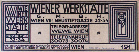
The integral elements of Wiener Werkstätte subsequently inspired many future iterations of graphic design, including the next evolutionary movement: Bauhaus.
Bauhaus
Bauhaus emerged during the 1910s, created by a German art school founded by the architect Walter Gropius in Weimar, and incorporated minimalism, geometry and simplistic colour schemes. One of the main principles of this design movement was ‘form follows function’. In my previous blog, Finding the Perfect Balance: Simplicity and Similarity in Branding, I discussed the concept of form following function and how each creative choice should contain a rationale and shall be functional. Bauhaus favoured a balance between a visual’s aesthetic elements and its functionality, creating a modern and elegant look. The colour schemes of Bauhaus used shades of black and white, with splashes of reds, blues and yellows.
Until the birth of Bauhaus, design had been heavily influenced by detailed and intricate fine art. However, Bauhaus strayed from this and focused less on decoration and more on function. Today, Bauhaus still leaves its legacy on designs, and it even went on to influence the iconic IKEA brand.

Art Deco
After a short period of minimalism and a world war, society craved optimism and positivity. Starting in Paris in 1910 and flourishing during the 1920s to early 1930s, Art Deco took hold of many things: architecture, design, visual arts and fashion. Some of the most notable uses of Art Deco can be seen in famous buildings’ designs, namely, the Empire State Building and the Chrysler Building in New York City. With the progress of machine-made products and structures, Art Deco’s objective was to create aesthetically pleasing visuals to complement the new and fast-appearing industrial creations.

https://www.vulture.com/2012/05/great-gatsby-poster.html
Art Deco got its name after the 1925 Exposition internationale des arts décoratifs et industriels modernes (International Exhibition of Modern Decorative and Industrial Arts) held in Paris, incorporated bright colours, golds, smooth curved lines and, like its predecessors, geometrics. Looking back to the Roaring Twenties and the widely-known Great Gatsby, opulence, wealth and glamour were at the forefront of design. This design style still prioritised functionality like Bauhaus but took a very different approach, indulging in aesthetics and elegance.

Paul Rand
Paul Rand first achieved recognition in the 1930s, designing pages for various magazines, but his true mark was made in the 70s with his logo design.
Inspired by Bauhaus, Rand brought a wave of change to corporate America when he was asked to create a logo for the tech company IBM. Rand’s ethos was that graphic design should be a universally understood language, thus making it timeless. This has been proven with IBM still exhibiting the same logo and the logo variation Eye-Bee-M fifty years later.


Rand didn’t only design a logo for IBM; television company ABC, American Express and UPS also employed his design skills.
In a strategic shift from the norm, Rand repositioned copywriting from its former role as the central driver of design to the same tier as design itself. This adjustment involved streamlining each element, creating a harmonious interaction between form and function. This refined approach enabled a more seamless blend within the design, enhancing its efficiency and effect.
Anton Stankowski
Another notable mention here is Anton Stankowski, a German painter and graphic designer. In 1974, Stankowski, along with seven other graphic designers were commissioned to create a new logo for Deutsche Bank. Stankowski’s logo stood out among the rest, with its simple, striking design, ensuring instant recognition for the brand.

The slash through the middle of the design portrays growth and dynamic development, while the square frame conveys security. Stankowski’s designs generally focus on illustrating the processes and etiquette behind a company, rather than objects. Anton Stankowski’s work was very important as he also developed Gestaltungslehre (theory of design), and introduced constructive graphic art.
Similarly to Paul Rand’s work, Stankowski’s logos are still in use today, such as the Viessman logo.

Memphis
When the 1980s hit, so did shell suits, bright colours and a favourite still today: Memphis design.
Initially emerging in the first half of the decade, Memphis’s oversized geometric shapes, lines and curves paired themselves with a bold colour palette. Drawing some inspiration from Bauhaus and Art Deco, Memphis’s geometric visuals portrayed optimism and euphoria. The famous television network MTV also adopted this style for its logo to convey a light-hearted playfulness.

Memphis design burst onto the scene with its exuberant energy, but it faded almost as quickly. The whimsical essence that defined it was short-lived in the realm of professional conditions. All was not lost; however, despite its decline in popularity, Memphis can still be found today – take sustainable loo roll company Who Gives A Crap, for example. Its packaging is submerged in kitsch, geometric visuals that serve as an ode to Memphis design.

90s Digital Design
In 1990, a creative revolution took form with the release of Adobe Photoshop, forever altering the landscape of graphic design. Before its creation, digital image editing incurred high costs, requiring businesses to outsource their design needs. However, these challenges significantly diminished after the emergence of Photoshop, resulting in a new era of cost-efficient solutions, thus beginning a new phase of graphic design accessible to almost anyone.
With this and the globalisation of the internet around this time, graphic design styles ran free with experimental colour schemes, shapes and typography. Considering the emergence of Comic Sans and Microsoft’s WordArt around the same time, designers leaned into this newfound freedom when creating logos. Take famous productions such as Friends, Clueless and Fresh Prince of Bel Air for example.

Despite these bright and eye-catching logos continuing their popularity throughout the 90s, minimalism returned to the framework towards the second half of the decade. Designers like Calvin Klein took a complete U-turn and strayed away from the earlier styles. A clean, stripped-back and neutral design palette was born. Keeping in line with famous TV and film productions, HBO’s Sex and the City (aired in 1999) showed the world its refined monochromatic colour palette and reserved typography.

Though bright colours and minimalism were pivotal design trends in the 90s, styles such as surrealism and grunge (cue The Matrix) deserve honourable mentions.
We have seen a large fluctuation throughout the last Century in graphic design. Many of those styles are at the centre of design today and continue to stand the test of time.
Stay tuned for the next instalment of our exploration of graphic design styles – the 21st-century edition. From the lines of Corporate-Memphis to the vibrant world of Frutiger Aero, we’ll delve into how design has evolved in the digital age.
If you would like to discuss your graphic design needs, don’t hesitate to contact me for an informal chat at mail@anjapeter.com. I’d be happy to help!