

Doqaru is a merger between a content marketing agency and a business development consultancy based in Aberdeen. The company specialises in strategy-led sales and marketing support for energy, technology, financial and professional services sectors.
Doqaru wanted a logo that encapsulated their core values in combining their two specialist services to provide bespoke solutions for their clients. It was key that their brand identity would ultimately encompass the company’s values and expertise.

Brand solution
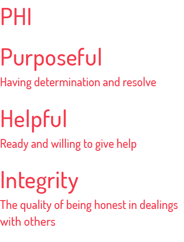
The main element of Doqaru’s brand is symbolised by ‘Phi’: the golden ratio in mathematics and the 21st letter of the Greek alphabet. The golden ratio defines the combination of two entities in a harmonious and balanced way, signifying the unity between Doqaru’s digital marketing and offline business development, with the brand values of:
Purposeful, Helpful, Integrity
Doqaru’s logo with tagline


The lowercase symbol Phi was incorporated into the ‘q’ symbol to convey the brand values. This became a challenging task when trying to keep the ‘q’ readable. A short tick was added to the end of the ‘q’ which is a handwriting technique to help readability.
This also emphasises the business growth that Doqaru offers, with the diagonal tick pointing in an upward movement to the top right corner. The triangle feature was also created to be in the same direction as the tick, to hold the logo in place and make it stand out further.

Corporate colours
The coral red was chosen as the main brand colour. It‘s a combination of the former companies’ red and yellow colours to signify their unity while conveying strength, energy and modernity. The marketing material accentuated the coral red logo and text with a rich dark purple background.
Corporate typeface
The corporate typeface consists of two fonts: Dosis and Open Sans. Dosis is used for the headlines and relates to the brand through its round endings which add a human touch. The main body text font is Open Sans which is highly readable both online and in print.


Business card
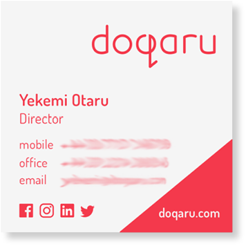
The business card design follows the key visuals of Doqaru’s branding and is printed with PANTONE 1787 C: a highly intense premixed colour that helps the card design stand out. Using Pantone rather than mixing the colours with CMYK when printing ensures that even small text is clear and highly readable.

Banners
Doqaru’s visual marketing remains consistent within the banner design and keeps the messaging for exhibitions or events clear and short.

Website
The website uses a combination of animation, graphics and tinted images for a unique touch that will stand out to competitors. For more information about the website development and design please read here.

“Anja took us through a creative journey and worked with us to bring our vision for Doqaru to life. We’re delighted with our brand. It’s energetic and versatile. People always comment on how strong it is!”
Yekemi Otaru, Director, Doqaru