
Norwell EDGE is an eLearning platform that gives access to learning in oil and gas to anyone anywhere in the world.
Norwell EDGE needed to introduce the platform to beta testers who would be testing it before it went live. We decided a short animated video was better than a blog post as it would ensure engagement while simply and briefly informing the testers on what the platform is and what was expected from them in the beta test phase.
The solution
For the planning and development of the beta tester video for Norwell EDGE, I worked together with a marketing specialist. She mediated the process between the client and myself, as well as developed the script for the animated video. Therefore, I could directly move onto developing a storyboard and a graphical style.
Creating a storyboard
Storyboarding is one of the most detailed and collaborative aspects of creating animated videos, as it is very important to ensure the final animation shows exactly what the audience needs to see.
Sketched storyboard
The creation of the animated explainer for Norwell EDGE began with a storyboarding process which consisted of basic sketches that gave an impression of what information would be included and in what order. Each one needed to be discussed and confirmed with the client to ensure exactly the right message was being delivered for each shot. The animated video was structured into 5 parts, clearly marked with numbers to guarantee an easy-to-follow explainer video for the testers.


Graphical storyboard
Once the sketched storyboard was approved, I developed a graphical style and colour palette to show the client how the animated video would look in the end. The graphical storyboard then needed approval before starting the animation process.
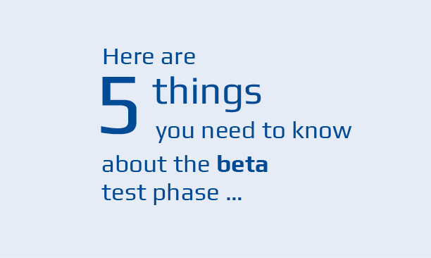

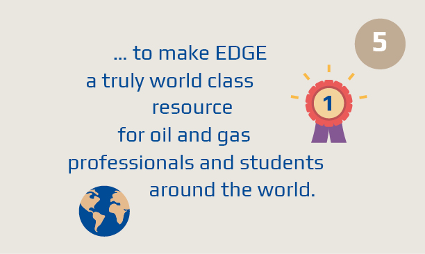
Developing a graphical style, colour palette and typography
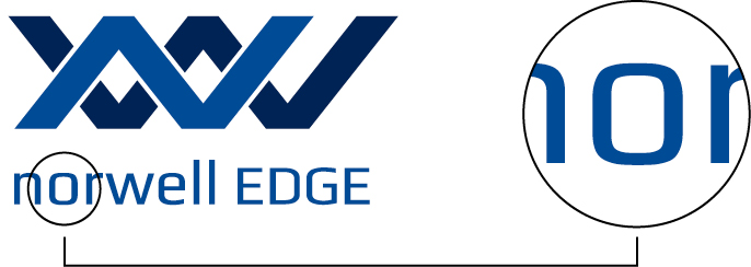
The typography for the animated video was Norwell EDGE’s corporate font, which I chose when developing the brand for Norwell EDGE. The font has an iconic “o” which is square with rounder edges. To align the icon world of the animated video with the brand, I created icons using the same edges similar to the “o”.



Colours used were the company colours seen below which included green, a light and dark blue as well as additional colours that fit with the palette. Each section of the animated video was numbered and had its specific background colour, making it easier to follow.
To ensure the beta testers will watch the animated video until the end, it was important to make it as short as possible while incorporating enough information for viewers to be clear on what the Norwell EDGE platform and the beta test phase are.



Music
A voiceover was not necessary for this explainer video as there was animated text to understand the content. However, background music was a good choice as we needed to encourage the beta testers to view this one-minute video until the end. We decided on uplifting, positive, and dynamic music to ensure viewers felt enthusiastic about trying out Norwell EDGE after they finished watching.