
Intero Integrity Services are based in the Netherlands and offer their clients a comprehensive range of industrial services related to the oil and gas industry, including pipeline services, inspection services, industrial cleaning and data management solutions.
Through my freelance work with the design studio Fifth Ring, I collaborated with them to create Intero’s brand. This encompassed their logo, website landing page, brand book, business card and roll up banners.

Brand Solution
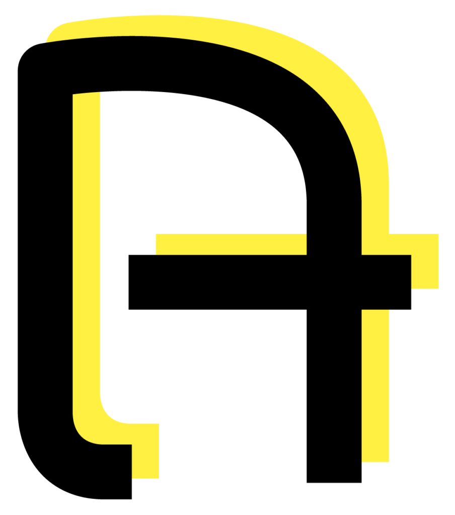
Intero Integrity Services which was formerly known as a.hak Industrial Services, were looking to reposition their brand, including a new name and complete new brand identity. They wanted their logo to look modern, flexible and fresh. This was achieved by choosing lower case lettering with rounded edges. The new logo highlights the ‘i’ in Intero, as this stands for most of the company’s core values and services:
– Integrity
– Innovation
– Inspection
– Industry/Industrial
– Insight on your space
The ‘i’ is shaped to emulate both, a pipeline and a person, and is placed in an enclosed space which relates to the company’s tagline being: We know your space. Once the new brand identity is known amongst clients and prospects, the shortcut ‘i’ can be used as a symbol or icon on Intero’s marketing material.
Intero’s new logo

Intero’s old logo

Corporate Colours
The black and yellow colour palette is often used to portray a warning. This relates to Intero’s constant observations to find and warn their customers of any issues with their equipment. Yellow also conveys information, which is at the forefront of Intero’s service.
Corporate Typeface
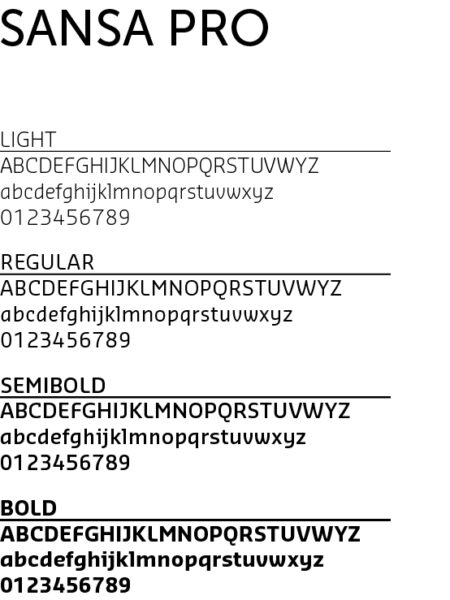
The headline font Sansa Pro is created by a Dutch typographer – a suitable choice as Intero is a Netherlands based company. Sansa Pro fits the brand perfectly as the letters have similar curves to the Intero logo. Certain letters such as the ‘e’ and ‘i’ have similarities to the bespoke font of the logo. Merriweather Sans is a clearly legible Google font which has a similar letter width to Sansa Pro.

Business Cards
An unusual design was created for Intero’s business cards. The outer shape of the ‘i’ became the shape of the portrait business card itself.


Landing Page
My expertise was required to ensure brand consistency and a strong design throughout the landing page. The shape used on the website matches the shape behind the ‘i’ of the logo to drive consistency and make the landing page recognisable.

Brand Book
Intero wanted a brand book that encapsulated a fresh vision and could give them a new positioning within the market.
A mix of round and sharp edged shapes nod to Intero’s expert precision, combined with the human quality behind the service.


The photographs bring viewers into the pipeline – emphasising Intero’s maintenance and inspection techniques that focus from the inside out.
The images were edited with a sepia tint. This matches the yellow and black colour palette, while portraying the pipes with a golden shine. The imagery and colours therefore convey an upmarket and premium service.

